
“Don’t worry about creating the perfect website. Just work on making it better. If we’re constantly evolving with the changing technology we’re going in the right direction.”

This idea has guided our team over the years and has encouraged us to always look for new adaptive approaches to web design.
Who knows? Maybe someday someone might build the “perfect website”. In the meantime, we will focus on progress, consistently striving for perfection, as we continue to make small but significant improvements along the way.
Now, coming to your website creation, here are some fundamental questions you should be asking yourself before getting started:
- Why are you creating this website?
- What audience (s) are you trying to reach?
- What do you hope to achieve with this website?
- What action do you want the audience to take as a result of visiting?
Designing the website can be deceptively difficult, as it involves achieving a design that is both usable and pleasing, conveys information and enhances brand equity, is technically sound and visually coherent. Let us consider some of the basic principles that will help you achieve web greatness.
Usability… how do users think?
Yes, usability, not the visual design, determines the success or failure of a website. We must never forget that the user is the only person who clicks the mouse, browse through the web pages and therefore decides the course of action on the website. Users search for useful contents that satisfy their online search queries. If the website does not meet their expectations, the back button is clicked within seconds and the search process is continued.
So it is important that you put yourself in the user’s mind. At the end of the day, your website is a tool for people to use, and people don’t like using annoying tools. In the same way, if users can’t use a feature, it might as well not exist.
Visual Design… what looks good and why?
Again before getting started, there are some factors you should consider.
Consistency
Consistency is a good goal for any web design. You should adhere to standards. There are certain things people expect and not going the expected way will cause them unnecessary confusion. For instance, people expect an underlined text to be a link, doing otherwise is not good usability practice.
Understand what they are expecting from a design point of view. Navigation, search placement, text structure, screen layout on all web pages, should apply the same consistent conceptual structure.
According to Krug’s first law of usability, the website should be obvious and self-explanatory. Do not make the users think! They don’t need to figure out how things work.
Colour
Colours affect the human psyche. A good website design implies that the overall visual effect sends the ‘message’ that needs to be communicated to the customers.
“The interaction of colours in a design through complementation, contrast and vibrancy.”
Complementation
The above statement is the colour theory, which is a basic principle to any web designer. Complementation focus on the way we view colours in terms of their relationships with other colours. For example, when colours occupy opposite ends of the colour spectrum, a visually appealing design is obtained. This is so because instead of straining to accommodate for a particular area of the colour spectrum, our eyes are provided a healthy balance. Applying complementation to your website design can make all the difference.
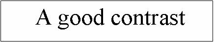
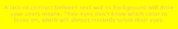
Contrast
Contrast is equally important in reducing eyestrain and focusing user attention. A good contrast clearly divides elements on a page. You should choose stark, complementary colours, so that the text becomes easily readable.
Vibrancy
In all its seriousness, vibrancy refers to the emotion of your design. Brighter colours make the user feels more energetic. They are recommended when trying to market a product or trigger an emotional response. Darker shades on the other hand keep the user relaxed, allowing their mind to focus on more important things.
To get your web design right, trust in the theory! Apply the colours chosen through the colour principle and then adjust as needed. You can use Adobe’s free online tool, kuler, to generate an appropriate colour scheme. But do not forget to use one that complements your logo, brand identity as well as other images on your website. Make sure that your theme remains focused, clear and uniform throughout the whole website.
Font
People come to your website looking for information. Your fonts should be easy to read. Keep it simple and visually pleasing. Sometimes, the fonts applied can mean the difference between a website that engages your visitors and one that turns them away. Here are some basics about fonts that will help you make the best choice for your website.
What font size?
Yes, size matters! Choose a font size that optimizes readability. It should be large enough for the average person to read off any screen. But at the same time, small enough to convey a professional look and minimize scrolling on the website.
Which font colour?
The font colour must provide high contrast otherwise it will limit readability. Use colours that coordinate with your company’s headings and traditional dark colours for your body text. Black and navy blue are highly recommended. No need to get overly-creative with the body font colour as it may hamper visual scanning of the web pages and distract the users.
Keep your text sizes consistent and proportioned so that headings and subheadings stand out appropriately. Having bold, definitive headings and subheadings provides for a quick and easy access to the website content.
It is important to note that your front reflects your company’s image, so choose one that reflects a professional tone. Also, limit the number of fonts per page and make sure to use the same fonts consistently throughout the whole website.
Simplicity, clarity and sharpness…
“Simplicity is the ultimate sophistication.”
Some web designers might show you a presentation full of gimmicks and tricks to make you think WOW! But the question is: How will your users feel on such a website?
Simplicity is at the core of a great design. Make it effortless for your users. The less people have to do to achieve their goal, the happier they will be and more often they will return. Besides, the simpler the website, the faster it loads. Another benefit of simple web design is that the website faces less trouble when it comes to compatibility with different browsers and platforms. It can be accessed easily from anywhere whether the user is on a computer or his/her mobile phone.
Make use of whitespace
When a new visitor approaches a design layout, the first thing he/she tries to do is to scan the page and divide the content area into digestible pieces of information.
Complex structures are harder to read, scan, analyze and work with. If you have the choice between separating two design segments by a visible line or by some whitespace, it’s usually better to make use of whitespace.
Hierarchical structures reduce complexity (Simon’s Law): the better you manage to provide users with a sense of visual hierarchy, the easier your content will be to perceive. Whitespace also helps to reduce the cognitive load for the visitors and makes it easier to perceive the information presented on the screen
Content is king!
The most important thing that makes up a website is the content. Visitors come to your website looking for useful information. But most importantly, visitors land onto your website through search processes carried out on search engines (that is, looking for information on Google, Bing…). Now, if the content of your website does not match their queries, your website will never surface on top of search engine results.
One important factor that is often overlooked: the web is different from print. Web users browse through websites within clicks. It is of utmost importance to adjust the writing style to users’ preferences and browsing habits. Exaggerated language will be ignored, heavy content with intricate wordings will turn off the visitors, promotional writing will be skipped, and long text of blocks will not be read.
Use a simple, clear and sharp language that facilitates on-screen reading. Be concise and to the point through light paragraphs, one idea per paragraph is usually recommended. Provide your visitors with valuable data that they might not get elsewhere and give them objective reasons why they should use your service or stay on your website rather than that of your competitor.
Apply TETO Principle
We have started with usability and will end with that. TETO (Test Early Test Often) is a principle that should be applied to every web design. Usability tests often provide crucial insights into significant problems and issues that users might encounter once the website is operational.
Testing one user is way better than testing none. And Testing one user early in the project is definitely better than testing 100 users near the end. It is common knowledge that errors are most likely to occur during the requirements and design phases.
Bottom line: if you want a great site, you’ve got to test. Sometimes, a particular website might work for a particular niche of users while the same may not have the same success with others. It is all about meeting the needs of your targeted users.
All in all, if you keep in mind the above factors, they will surely pay rich dividends. The proper mix of design, responsiveness, interactivity and simplicity will definitely help you design a website that will leave a lasting impression.